This post was written by Lisa McNamara and originally appeared on frame.io Insider on Sept. 25, 2023.
From the world’s largest court and the boisterous fans to the opening-night musical acts and the marathon matches that extend into the wee hours, it’s like the Super Bowl of professional tennis.
This year, the record-breaking crowds and a new generation of diverse athletes inspired Sky Sports to create an energetic broadcast graphics package representative of the unique environment in which the tournament takes place.
For our latest Made in Frame, we were lucky enough to talk to the teams who created them and to learn why they think Adobe Creative Cloud and Frame.io is a winning combination.
The players and the challenge

Harry Ward is the Creative Director of Broadcast Design for Sky Sports and Sky News. After several successful collaborations with London-based Coffee & TV, a full-service creative studio, he once again selected them for this package. “They’re brilliant partners for us at Sky Creative,” he says. “Their approach is highly collaborative and they always drive for achieving the very best end product.”
We also heard from Coffee & TV’s Senior Motion Designer and Animation Director, Danny Boyle, who echoes Harry’s sentiments. “The trust shown in us by Sky made for an atmosphere of collaboration which is evident in the work,” he states.

With the right players lined up, the challenge was to create a full broadcast brand package, from a main 30-second spot to five 5-second bumpers. The creative direction from the beginning, according to Harry, was to highlight what makes the US Open an event like no other. “It is arguably the most exciting, most unique Grand Slam event in tennis. Based in Queens, New York, and with the mission to be ‘built on diversity, inclusion, and respect,’ it’s the perfect stage for tennis stars from all backgrounds to achieve legendary status in front of the next generation of sports fans,” he says.
Americans Coco Gauff (this year’s US Open women’s champion) and Frances Tiafoe (quarter finalist) feature prominently in the piece, along with four-time champ, Novak Djokovic, among others.
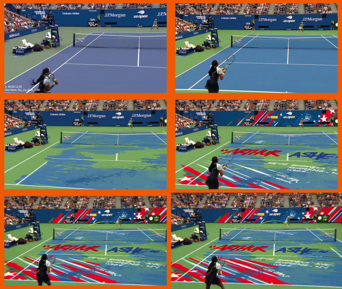
“The sequence underscores the tournament’s mission with a rally between a diverse set of exciting tennis stars, each leaving their mark on the world-famous Arthur Ashe court,” Harry says. “The graphic style takes inspiration from the urban street art found in nearby Queens, featuring bespoke tags for each player, an American color palette, and a music track that feels distinctly New York. The result is a colorful, action-packed sequence full of personal expression and plenty of fun.”
A solid game plan

According to Danny, Sky came to Coffee & TV with a visual concept to be brought to life. “The idea was to combine the New York street art of ‘tagging’ with an exciting edit composed of pre-existing footage from previous US Opens. The colors of the court and the American flag, as well as the yellow of the Sky Sports branding, were also key components of the overall aesthetic that we developed with Emma Knudsen at Sky,” he says. “We used Photoshop, Illustrator, and After Effects early on to develop the existing artwork, test out how we could ‘tag’ players onto the screen, and experiment with ways of animating and compositing the artwork onto the live-action plates.”

The teams spent about a month preparing the various elements necessary to create the overall composite. “We were generating all the artwork, animating the tags, and creating rough comps for each shot. It was quite motion-graphics heavy, but there was also a lot of 3D development going on, too,” Danny says.
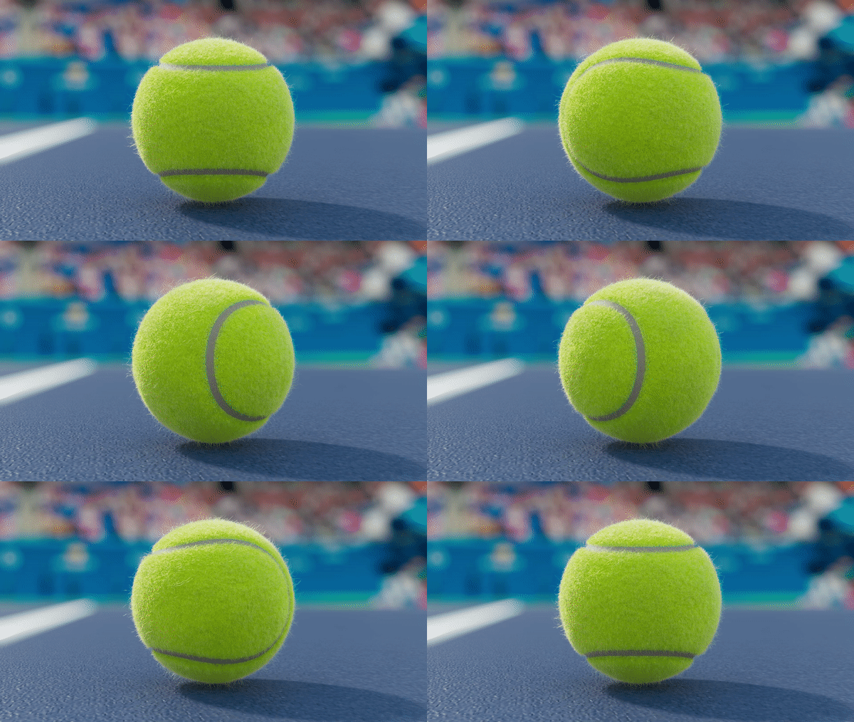
If you’re a tennis fan and have ever watched the shots of balls hitting rackets in slow motion, you’ll have noticed the squashing effect as they strike the surface. The Coffee & TV team took great pains to mimic that effect and use it to artistic advantage.

“It became apparent that we needed to create some custom macro shots of the tennis ball to punctuate the existing edit, so our 3D team spent this early period building and animating previs shots and researching how tennis balls looked and moved. They were meticulous in their research—down to the fuzz on the ball and how it deformed in slow-motion,” he adds.
Once all the animated elements were created, there was another month’s painstaking work to place them into the live-action. Part of that process included removing the athletes from the courts in the live-action plates in order to composite the graphics on the court’s surface.
“It’s a fast-paced, high-octane piece of content, and there are 30 (or so) shots in total, so a lot of work needed to be done to insert the tagging narrative into each one, as well as elevating the sports footage into something more cinematic,” Danny says.
That last task fell to Coffee & TV Head of Color Simona Cristea (you can check out her showreel, below), who was responsible for taking the original broadcast television video footage and imbuing it with depth and richness. “We wanted to maintain a balance between all the animation and the live footage, both in terms of composition and action, by elevating the sports footage and bringing the artwork to life,” Danny explains. “Simona did a brilliant job grading the edit.”
The Right Gear

Every professional athlete knows how important the right gear is to their game. Having a kit they can depend on is critical to their ability to prevail even in extreme circumstances.
It’s why Coffee & TV have come to rely on Photoshop, Illustrator, and After Effects. “Using the suite together allows us to easily transfer assets between various tools—whether that’s generating artwork, creating clean backplates, animating the tags, or compositing all these elements together,” Danny says.
Harry agrees. “The seamless integration between Adobe products and familiarity of interface is a key driver for us, as well as its reliability and stability as a product. In broadcast we often have hundreds of deliverables for even the smallest project, so reliability is crucial.”
Coffee & TV are longtime Frame.io users who, with a staff of approximately 80, are accustomed to collaborating remotely whether they’re working within the same country—or even the same building.
On this project, the team comprised eight motion-design artists, four CGI artists, two compositors, two colorists, two internal producers and then approximately ten stakeholders from Sky—and Danny acknowledges that Frame.io was key to their success.
Match points
Anyone who follows tennis knows that it takes a thrilling combination of skill, speed, and smarts to win. But there’s also an element of joy in just playing the match—both for the athletes and the spectators.
It’s that kind of joy that makes a studio like Coffee & TV so enthusiastic about their clients. With a range that includes film, television, and commercial projects for everyone from Disney+ to BMW, Lego, and Lexus, the studio knows how to create an experience that everyone will enjoy.
Clearly, Coffee & TV scored points with Sky. According to Harry, “The end result is a riot of color and personal expression—so much fun to watch and such fun to create.”
From Coffee & TV’s perspective, they hope for a rematch. “We’re really happy with how it turned out and can’t wait to work on the next one with the folks at Sky.”
Winning at love. That’s the best possible outcome for all the players involved.
This post was written by Lisa McNamara and originally appeared on frame.io Insider on Sept. 25, 2023.
Author: Sponsored Content
This article comes from No Film School and can be read on the original site.
