
When the Harry Potter books exploded onto the scene, I remember just sitting in a worn Lay-Z-Boy for hours and imagining the worlds on the page. Once the Harry Potter movies to the big screen, I didn’t have to imagine any longer. We got to see the magical world of Hogwarts not only come to life visually but also evolve over 15 years.
Today, I want to dig into the franchise’s visual storytelling and see what we can learn.
Let’s dive in.
Early Years of Wonderment
Harry Potter and the Sorcerer’s Stone and Harry Potter and the Chamber of Secrets
The early films in the Potter world were some of the hottest commodities. Every company wanted them and every director as well.
But these movies didn’t have the hindsight we have now. they were made with books still coming out, so the visual style in the series was always made to be changed if needed later.
The sweepstakes of the first two films was won by Chris Columbus, who established a visually bright and warm aesthetic. The aim was to capture the wonder and magic of discovering the wizarding world through Harry’s eyes.
And to make a movie that kids of all ages could enjoy.
The color palette was vibrant, and the lighting was generally soft, creating a sense of enchantment and childhood innocence.
The Major Shift

Harry Potter and the Prisoner of Azkaban
By the time we hit the third movie, the world of Harry Potter was noticeably darker. And it kind of had to be. the books and movies were dealing with prison escapes, more murder, and even the death penalty.
Alfonso Cuarón’s direction brought a significant shift in visual style. And I think set the franchise off closer to what the books imagined.
We had a more muted color palette that emphasized shadows and maturity.
This movie might be the most important in the series. It had to be the bridge into a new style for the kids to get older and for the series to continue to have life-and-death stakes.
Loss and Death Take Center Stage

Harry Potter and the Goblet of Fire, Harry Potter and the Order of the Phoenix, and Harry Potter and the Half-Blood Prince
The middle of the is like a dimmer headed downward in terms of lighting. We get a change in color theory as things get greener when the Death Eaters and Voldemort get more and more power.
The visual effects also increased in complexity, to keep up with the story.
These three movies are like the steadfast Potter movies that ironed out all the looks. We needed consistency, and director David Yates capitalized on what Mike Newell did and offered a guiding hand for the rest of the series.
A Dark Finale
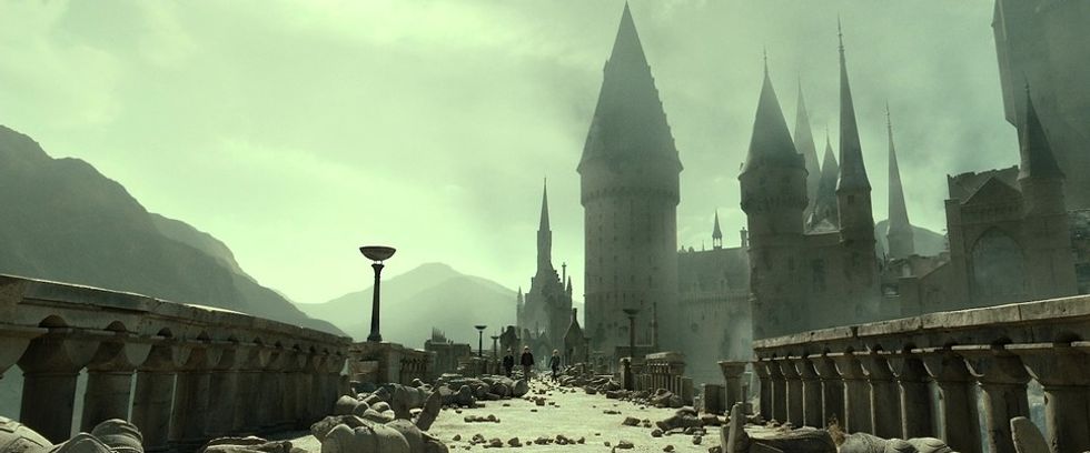
Harry Potter and the Deathly Hallows – Part 1 and Part 2
The final two films embraced a stark and contrasting visual style that felt like it was the culmination of what had happened in all the films prior. Sure, we got darkness, but we also had small, subtle, playful moments that harkened back to the franchise’s roots.
The production design of Hogwarts, in particular, really came into play in the final movie, with is geography so established by the other movies that it got to all be paid off in this one and feel earned.
But by the time we got to the epilogue at the end, King’s Cross directly resembles the family vibes of the first movie, signifying a return to those bright days.
Summing Up The Evolution of The Harry Potter Movies’ Visual Style
The Harry Potter series is one of my favorites. I not only love the world and the magic, but it teaches you so much about how to make your screenplays more visual. And I was happy with what the filmmakers brought to the big screen.
I’m so interested in how the TV show will tackle visuals in the earlier seasons, especially when they know where the story is headed, so they have a preview of the darkness that’s around the corner.
Let me know what you think in the comments.
Author: Jason Hellerman
This article comes from No Film School and can be read on the original site.